Interface & command palette
TruePPM’s v2 interface is a single, calm workspace shell built on the navy/sage design system. Everything you need to orient — where you are, what’s healthy, what to do next — lives in one top bar, and a keyboard-first command palette gets you anywhere without reaching for the mouse.
The unified app-shell bar
Section titled “The unified app-shell bar”The top of every project and program is a single bar (it merges what used to be two stacked rows). Left to right it carries:
- Adaptive identity — a breadcrumb of your current program / project. It shows in the bar only when the left rail is collapsed or you’re on a phone, so wayfinding is never duplicated.
- Project switcher — a compact, searchable dropdown at the left edge of the view tabs that lets you jump between the projects you’re a member of without leaving the project view. Selecting a project keeps you on the same view you were looking at (Schedule stays on Schedule), and it’s fully keyboard- and screen-reader accessible. On a project, it shows the current project’s name (or, when you belong to just one, plain non-clickable wayfinding). Off a project — on My Work, Notifications, or a listing page — the same control becomes a “Jump to project…” picker so any project you’re a member of is one hop away from anywhere; it’s hidden only when you belong to no projects at all.
- View tabs — the grouped, methodology-adaptive navigation (below). The strip scrolls horizontally on narrow screens rather than dropping or clipping labels.
- The health cluster — one bordered context read-out (below).
- Context-aware ”+ New” — a create menu whose default action matches where you are (a new task on the board, a new risk on the risk register, and so on).
- Presence, run status, notifications, and your account menu — including the Light / Dark / Auto theme toggle, which lives only here.
Background task runs
Section titled “Background task runs”A small badge on the right side of the top bar reads “N background operation(s) running” and appears only while at least one task is in flight (a schedule recalculation, an import, an export job); it disappears the moment the count returns to zero, so the calm shell stays quiet rather than carrying a permanently-visible, empty run indicator. A spinner and a live count sit inside it, and it’s announced to screen readers as a live status update.
The badge updates itself the moment a background job starts, makes progress, or finishes — it doesn’t need to ask the server for an update. For anyone building against the API, three endpoints back the same underlying run records at different scopes:
| Endpoint | Scope |
|---|---|
GET /api/v1/task-runs/{id}/ | A single run by id, from anywhere. |
GET /api/v1/task-runs/active/ | Every pending/running run across the projects you belong to — the personal in-flight view this badge summarizes into one count. Not a PMO rollup. |
GET /api/v1/projects/{project_id}/task-runs/ | A project’s own run history; POST .../task-runs/{id}/cancel/ (Project Manager or above) requests cancellation of one still in flight. |
GET /api/v1/projects/{project_id}/scheduler-runs/ | The scheduler-recalculation subset of a project’s run history, filterable by status and date range — the audit trail behind the Schedule view’s “last recalculated” indicator. |
The command palette (⌘K)
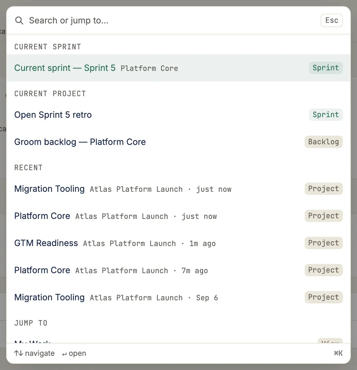
Section titled “The command palette (⌘K)”Press ⌘K (Ctrl+K on Windows/Linux) anywhere to open the command palette. It is the fastest path to:
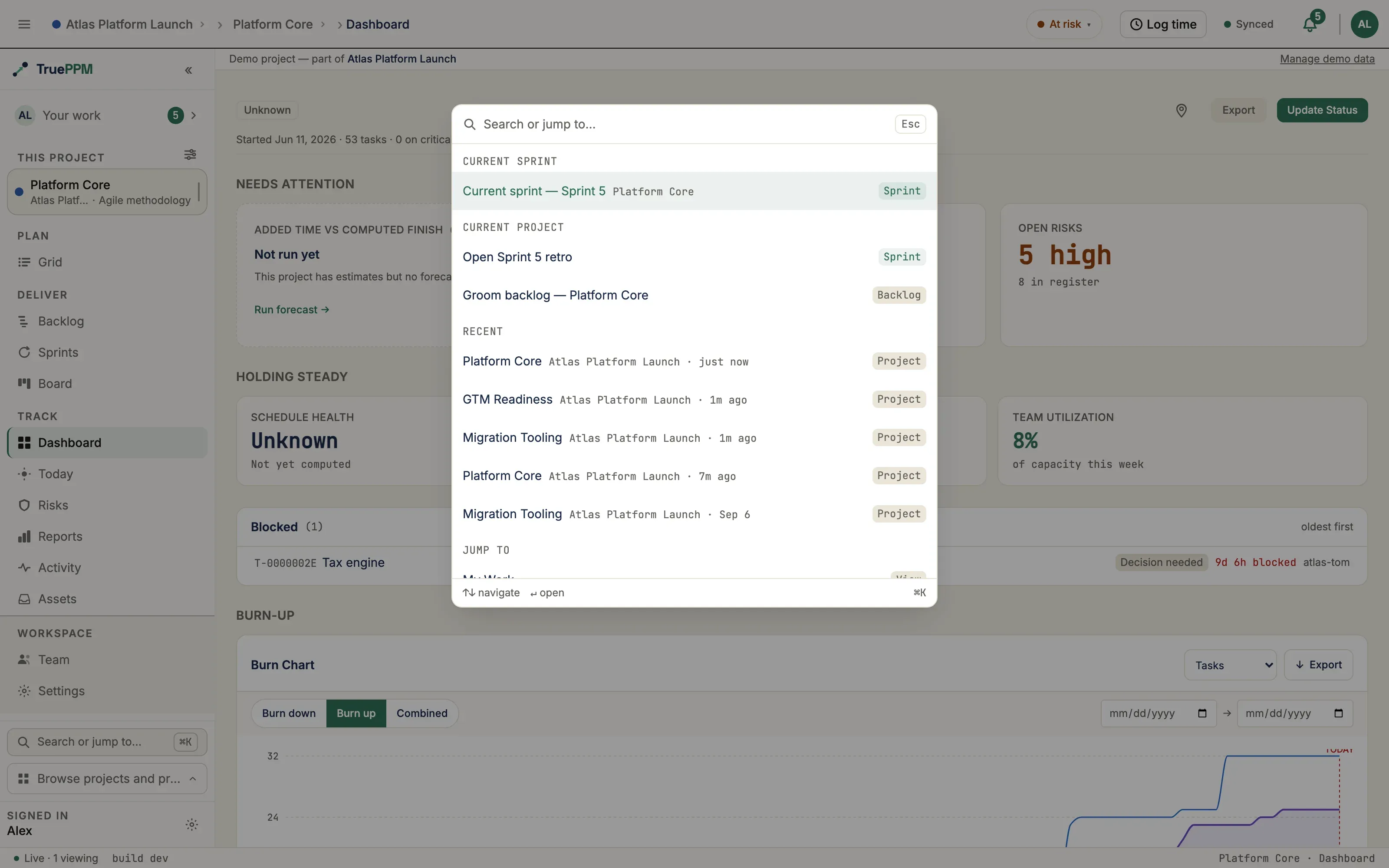
- Jump to any view — “Go to Board”, “Go to Schedule”, including views you’ve hidden from the tab bar.
- Navigate between your projects and programs — resolve any project or program by name from anywhere, not just your current one.
- Pick up where you left off — a Recent group lists the projects you’ve most recently opened (with their program and a “2h ago” recency hint) the moment you open the palette, before you type a thing.
- Find people — start typing a name to search across your teammates and jump to them.
- Find any work item anywhere — type a name to search across every program and project you belong to, without opening each one first. Results arrive in Epics, Stories, Milestones, and Tasks in all projects groups, each carrying a program ▸ project breadcrumb (never a WBS code): pick one to jump to it in the schedule, or a backlog item to land on its program backlog. Plain tasks and milestones are included by default, so a waterfall project with no epics or stories is fully searchable. The search is access-scoped on the server — you only ever see work you already have access to.
- Open a task — on a project, type to find a task and open it inline. When the project has an active sprint, that sprint’s tasks get their own Current sprint tasks group with room for more results, so a search scoped to the sprint you’re working in isn’t cut short.
- Filter tasks by label — on a project, type a label’s name and a Labels group offers it with its color swatch and how many tasks carry it. Pick one to land on the Board with that label filter already applied, so “show me everything tagged Rework” is two keystrokes rather than a hunt through the filter menu. Labels belong to a project, so the group offers the current project’s labels.
- Jump to a settings section — start typing and a Settings group surfaces the exact section you want (type “smtp” for Email & SMTP, “oidc” for Single sign-on, “tokens” for your personal API tokens). Workspace sections appear for workspace admins; your personal settings appear for everyone, each labeled Workspace or Personal so same-named sections stay clear. Pick one to land right on it.
- Run actions in context.
Type to filter; arrow keys move; Enter activates; Escape closes. The palette is a pop surface with a focus trap, so keyboard and screen-reader users get the same reach as a pointer.
Filtering the settings rail
Section titled “Filtering the settings rail”Once you’re inside settings, the left navigation rail has a filter box at the top. Type to narrow the section list — it matches synonyms as well as labels, so “smtp” finds Email & SMTP and “oidc” finds Single sign-on — and press Enter to jump to the first match. Clearing it (the ✕, or Escape) restores the full rail. The filter is on the desktop rail; on a phone the settings header keeps its Jump to section menu.
The methodology-adaptive context bar
Section titled “The methodology-adaptive context bar”The health cluster is a single bordered unit whose three segments adapt to the project’s methodology, so you always see the right three signals:
- Agile — active Sprint · Points (or item count) · Velocity
- Waterfall — Forecast (P80) · At-risk · Critical
- Hybrid — Sprint · Forecast · Critical
The forecast shown here is a P80 date — the date the schedule’s forecast is confident about roughly 8 times out of 10 — and Velocity is how much work the team typically finishes per sprint. Slots are fixed: a zero or empty segment reads calmly (“0 critical”, ”—”, “No active sprint”) rather than vanishing, so the bar never reflows. At-risk and critical counts above zero open a task popover; a forecast date is neutral (informational, not a risk colour); and team-private velocity shows a “kept to the team” wall rather than a number when the team’s privacy policy withholds it.
The health word, and where it came from
Section titled “The health word, and where it came from”The chip’s word — On track, At risk, or Critical — is the project’s health as the server decides it, and a project manager’s manual health report outranks the task counts. So the word can be worse (or better) than anything in the rows beneath it: a PM who reports Critical on a plan with no at-risk and no critical tasks knows something the schedule’s own numbers — float included (how many days a task can slip before it delays the project) — do not.
When that is what you are looking at, the popover says so. Under the word you get Reported by the project manager, with View on Dashboard › taking you to the project’s Dashboard, where the report lives and — if you are a Project Manager or Project Admin — where you change it. Without that line, the word came from the plan itself, and the at-risk and critical rows below it are the whole explanation.
This matters most on Schedule and Board, where the top bar is the only health reading on the page.
When health can’t be read
Section titled “When health can’t be read”If the health summary fails to load, the chip does not fall back to a reassuring word. It shows a muted Health — with a hollow dot; opening it tells you the read failed and offers Retry, which re-runs just that request rather than reloading the app. A calm “On track” over a project nobody could read is worse than saying nothing. While the summary is still loading for the first time, the chip is a plain placeholder — no word, no colour.
Grouped, methodology-adaptive project views
Section titled “Grouped, methodology-adaptive project views”The project rail groups its views into three bands named for what you are doing — Plan, Deliver, Track — in the order work moves through them, followed by a Workspace band that is ruled off and pinned to the bottom of the rail:
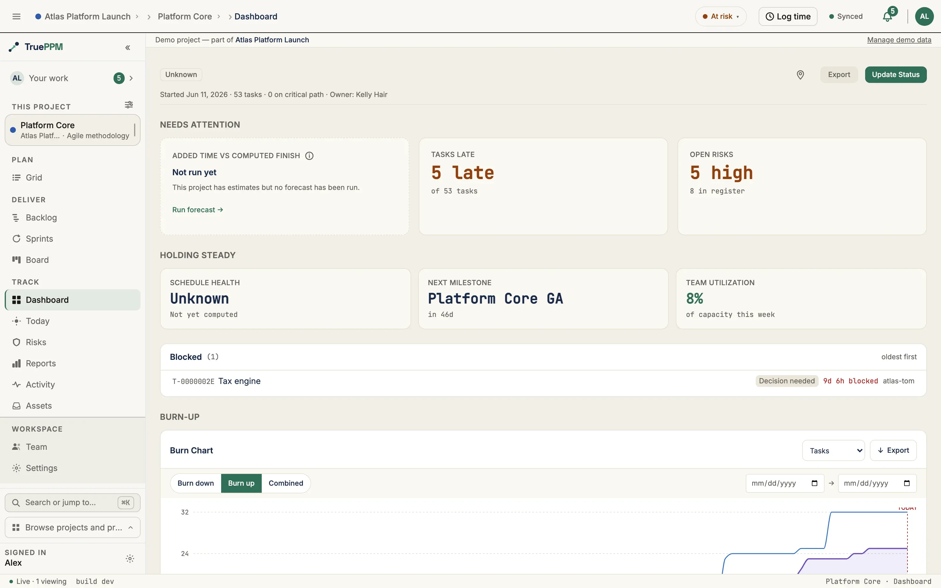
| Band | What it holds | What it answers |
|---|---|---|
| Plan | Schedule · Grid · Calendar | When is the work, and how is it broken down? |
| Deliver | Backlog · Sprints · Board | What is the squad doing this iteration? |
| Track | Dashboard · Today · Risks · Reports · Activity · Assets | How is it going? |
| Workspace | Team · Settings | Who is on this project, and how is it set up? |
Deliver exists only on agile and hybrid projects, where it co-locates the sprint circuit (Backlog → Sprints → Board) as one object. On a waterfall project there is no sprint cadence to name, so the band is absent and Board sits in Track as a plain kanban. The rest of the set adapts to methodology the same way — an agile project doesn’t show the Gantt-centric views a waterfall project leads with, and vice-versa.
Workspace is a different kind of thing, not a lower-ranked fourth band. Plan, Deliver and Track are steps in the life of the work; Team and Settings are the project’s own setup, which is why they sit below the rule rather than at the end of the sequence. They are drawn at exactly the same size, weight and color as every other row — the rail says “elsewhere” by changing the floor beneath them, never by fading them out. The band holds its place at the bottom no matter how many bands sit above it, so Settings is always in the same spot.
Dashboard is the project’s landing surface and the first row in Track. The earlier name, “Overview”, described where the row sat rather than what it was, and once it joins a band that name is simply wrong.
You can tailor the rail with Customize views (hide the views you don’t use); hidden views stay reachable from the command palette. Dashboard and Settings can never be hidden, so your navigation can never end up empty.
Collapsing the rail
Section titled “Collapsing the rail”Press ⌘B / Ctrl+B, or use the ≡ in the shell bar, to collapse the rail to a narrow icon rail. Collapsed, it keeps every row as an icon with its name on hover and for screen readers, keeps the band structure, and keeps any counts — so you can still see where you are and whether anything is waiting for you without giving up the width. Press the same chord again to expand it.
Two things do not appear at icon width: the Customize views control and the Browse projects and programs switcher, both of which need more room than the rail has. ⌘K reaches everything the switcher does, and expanding is one keystroke.
The rail never disappears entirely. If you want the maximum canvas for a wide Schedule, that is a separate need and is not what collapse does. See View focus for the role-based lens that re-orders and re-points these surfaces for you — it re-orders the three verb bands only, and leaves Workspace alone.
Pinned projects and programs
Section titled “Pinned projects and programs”Pin the projects and programs you return to daily and they collect in a Pinned group at the top of the sidebar, so the handful you actually work on are one click away regardless of how many you can see.
Pin from any of these:
- the pin in the Project Overview header, beside the project’s actions;
- the pin beside a program’s name on its Overview;
- the pin in the top corner of a program card on the Programs directory;
- the project rows on a program’s Projects tab;
- the project and program rows in the sidebar’s Browse switcher;
- the command palette — Cmd+K (Ctrl+K on Windows and Linux) opens on your pins, and typing a name offers Pin and Unpin as commands. Alt+P pins or unpins the highlighted row without closing the palette.
Select the pin again to unpin. Every confirmation carries Undo for a few seconds, so nothing here is a one-way door.
On a touch device the pin is always visible — you do not need to hover to find it. On a mouse, an unpinned row reveals its pin as you hover, and keyboard focus reveals it too.
Where pinned items appear
Section titled “Where pinned items appear”On the Programs directory, pins are lifted into their own Pinned group above Everything else. Each heading names its count and confirms that whichever sort you chose still applies inside the group — pinning changes the grouping, never the sort. Turn the Pinned first checkbox off for one flat list in pure sort order, with pinned cards keeping their mark. Searching flattens the groups, so a pin never outranks a better text match.
A newly pinned card stays where it is rather than jumping to the top under your cursor. It moves into the Pinned group the next time you open the page, or straight away if you choose Re-sort now in the confirmation.
A pin is private to you. It is a personal shortcut, not a signal about the project: pinning grants no access, changes nothing for anyone else, and no screen, export, or API response tells another person what you have pinned or how many people pinned a given project. Teammates cannot see your pins, and you cannot see theirs.
You can pin up to 100 items. Past that, unpin something before adding another — the app says so plainly rather than silently dropping the new pin.
Role-based landing
Section titled “Role-based landing”Opening a project lands you on the view that matches your View focus lens — a PM lands on the Schedule, a Scrum Master on the Board, and the neutral default lands on Today. The lens is presentation only: it never changes your permissions or what anyone else sees.
Light, Dark, and Auto
Section titled “Light, Dark, and Auto”The whole interface supports Light, Dark, and Auto themes via a single toggle in your account menu. Chrome and content adapt together — there is never a dark sidebar stranded on a light app.
When your session expires
Section titled “When your session expires”If your session expires while you’re working — a timed-out token, a signed-out tab left open — TruePPM shows a “Your session expired” prompt rather than silently dropping you onto the login screen with no explanation. From there you can:
- Sign in to re-authenticate immediately, or
- Continue viewing (read-only) to keep looking at whatever the app already has loaded in this tab — the schedule, a board, a report — without losing your place. This dismisses the blocking prompt in favor of a slim banner pinned to the top of the screen that stays visible while you browse.
Read-only mode never fetches new data (nothing more can load until you sign in again) and never sends writes: if you try to save, complete, or otherwise change anything while read-only, TruePPM blocks the attempt before it reaches the server and brings the sign-in prompt back rather than failing silently. Sign in again from either the original prompt or the persistent banner to resume normal work.