Schedule Toolbar
This is for anyone working in the Schedule view day to day. The toolbar gives you the at-a-glance project status (rightmost summary chip), the day-to-day filtering controls (toggle groups), and the actions for adding to the plan (+ Item, + Milestone, + Phase).
Of the three, only + Item sits in the bar by default. + Milestone and + Phase start in the Actions menu: each is a one-click structural insert that lands at your current insertion point, and the bar is also where you click while simply reading a plan. Both keep their keyboard shortcuts, and either can be pinned into the bar from Display → Outline.
The mode chip comes first, ahead of + Item, because it decides whether the controls after it are there at all. In Read mode it reads Read only · Switch to Author to edit, and + Item, + Milestone, + Phase, Group and Ungroup are hidden, both in the bar and in the Actions menu. To edit, open the chip and turn on Author mode, or press Alt + A. If the plan has an active baseline, the chip shows which one your edits are measured against (for example Author · vs Baseline v1).

Toolbar layout
Section titled “Toolbar layout”[ Author ▾ ] [ + Item ] ( + Milestone, + Phase · Group · Ungroup — in the Actions menu by default )[ CP only · Focus chain ] [ Critical path · Milestones ] ...[ {N} items · {S} in sprints · {C} critical · CPM ✓ ] [ Grid | Timeline ] [ Today ] [ − {level} + ] [ Fit ]Fitting the window
Section titled “Fitting the window”The toolbar is one row at every width, and it never scrolls or cuts a control off. Instead it measures itself and gives ground in a fixed order until everything fits.
It concedes in two stages, and the first is always spent before the second:
- Things shorten in place. The summary chip drops its lowest-priority token, then
its words before its numbers (
142 items · 12 in sprints · 9 critical · CPM ✓→142 · 9 ▲ · ✓→CPM ✓), the insert sentence shortens, and the zoom stepper becomes aMonth ▾menu. Nothing has left the toolbar at this point — each control still shows its current value, and the parts that no longer fit are in its own menu. - Then commands move into
Actions. Export PDF goes first, then Milestone, and Today last of all. A control that moves keeps its name and its keyboard shortcut, and the menu says why it moved: From the toolbar — no room at this width for one the window squeezed out, Not in the toolbar for one you unpinned yourself.
The Actions menu itself is always in the toolbar. At 1024px and wider its button
reads Actions ▾; below that it shrinks to a ⋯ button, the same width tier at
which Display drops its label.
The mode chip is never one of them, and it never collapses either — it is one control, the same size, at every width. Whether you are in Read or Author mode stays visible in the toolbar always, because a mode you cannot see is a mode you will be surprised by. The same goes for the session-trail count and the recalculating indicator: they compact to a glyph, but they never move behind a click.
Widening the window gives everything back, in reverse.
Choosing what stays
Section titled “Choosing what stays”Display → In the toolbar is where you decide which controls get toolbar width.
Each row states where that control is right now — in the bar or in Actions — which
makes this the one place that answers “where did my button go”.
| Control | Default |
|---|---|
| Milestone | in Actions |
| Phase, Group and Ungroup buttons | in Actions |
| Export PDF | in the toolbar |
| Task and critical counts | in the toolbar |
| Today | in the toolbar |
Two rows at the bottom are shown but cannot be changed: + Item, Grid / Timeline,
Display, Actions and the mode chip are always in the toolbar, and zoom and the engine
status are always present but collapse when the bar is narrow. They are listed so the
inventory is complete rather than leaving you to guess what happened to them.
A pin is a request, not a guarantee. If the window is too narrow to honour all of them the toolbar still refuses to clip, and the footer tells you plainly — “2 of 4 pinned controls fit at this width. Collapse the sidebar or unpin one to get the rest back.” Collapsing the sidebar buys back roughly a full tier.
These choices are yours alone: they are stored per person, per project, in your browser, and change nothing about the plan or what anyone else sees.
Layout: Grid and Timeline
Section titled “Layout: Grid and Timeline”A Grid | Timeline toggle controls how much of the schedule the view devotes to the
table versus the bars. Both layouts render the same rows — the same order, the same
nesting, the same collapsed phases, the same fold carets, mode gutters, drag grips and
insert points. What changes is only how many columns the outline gives you:
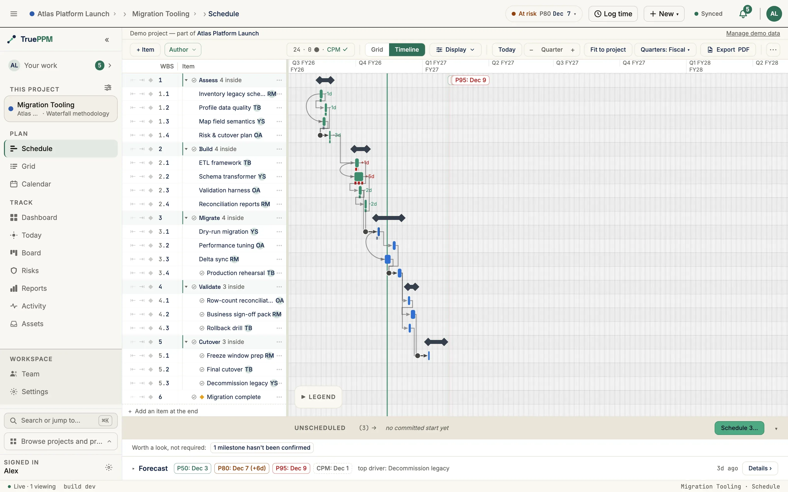
- Grid (default) — the full item-list table (WBS, Item, Links, Dur, Start, Finish, %, Owner) sits to the left of the bars, with a draggable splitter between them.
- Timeline — the outline narrows to WBS + Item, and Links, Duration, Start, Finish, % and Owner give their width to the bar track. Links is absent there on purpose: the canvas already draws the dependency arrows. Nothing about the plan’s shape is hidden: a phase is still a phase, a collapsed phase is still collapsed, and collapsing one here keeps it collapsed when you switch back.
Because the outline is present in both layouts, a task’s name is always in a real, row-aligned column two cells to the left of its bar. On-bar names are therefore optional in both (see Task names below), and a milestone’s name is never repeated in the track.
Drag the splitter to trade outline width for bar-track width. It stops before the bar track gets too narrow to read, so the timeline cannot be pushed off the edge of the window.
The choice is a per-user view preference saved in your browser, so the Schedule reopens in the layout you last used.
Filter groups
Section titled “Filter groups”Filters are split into two clusters so they don’t read as a “pick one of four” radio. All four can be on at once.
View filters — change which rows appear in the task list:
- CP only — collapse to the critical path only (and the summary tasks above them, so the WBS hierarchy stays intact).
- Focus chain — when a task is selected, dim every task that isn’t a predecessor or successor of it.
Render filters — change which bars draw on the Gantt timeline:
- Critical path — show only critical-path bars + summaries (other tasks render their list row but their bars are hidden).
- Milestones — show only milestone diamonds + summaries.
Chart — control what the timeline paints (presentation, not a data filter):
- Dependency lines — show or hide all dependency arrows.
- Task names — place on-bar names Next to bar or Hidden. This placement is remembered independently for Grid and Timeline — the sub-label names the view it applies to (Task names (Grid) / Task names (Timeline)) — and both default to Hidden, because the outline already shows every name in both layouts. Choose Next to bar where a name riding along with its bar as you scroll is worth the extra ink; the label caps with an ellipsis to the room it has, and flips to the left of the bar when the bar runs long. (0.3 offered a third placement, Aligned left, which drew a name column onto the canvas for the layout that hid the outline. 0.4 removed it, and an existing preference for it became Hidden.)
- Progress % — show or hide the on-bar completion pills.
Chart choices are saved per-user in your browser. Unlike the view/render filters (which are encoded in the URL so a filtered view is shareable), Chart choices are personal presentation preferences and stay local. Hiding a Chart element lights the Display trigger’s badge so nothing disappears silently (a hidden on-bar task name is the one exception, on either layout — the name is still right there in the outline, so the badge stays quiet), and a PDF export opens matching what you see — hide the dependency lines and the export’s arrow toggle starts off to match.
Summary chip
Section titled “Summary chip”Rightmost in the toolbar (above the Today + Zoom controls). Format: {N} items · {S} in sprints · {C} critical · CPM ✓.
{N} items: every row currently visible after filtering — tasks, phases and milestones alike. The noun is deliberately neutral: a row’s type is a declared property, so a count that spans all three cannot call them tasks.{S} in sprints: how many of those rows are committed to a sprint, excluding phase summaries. On a hybrid plan this is the one place on the Schedule that says how much of it is running iteratively. If your project renames its iteration container (Settings → How this team works), this token follows that name —3 in iterations,3 in PIs.{C} critical: rows on the critical path, excluding phase summaries.✓(green): CPM ran successfully against the current data.⚠(amber): the scheduling engine reported an error — usually a cyclic dependency. Open the Schedule’s status banner or check task dependencies.CPM …(italic): a recompute is in flight.
The chip is a role="status" announcement for screen readers — every state change is read aloud. Its spoken form stays complete at every width: when the toolbar tightens and the chip sheds tokens on screen, the announcement still carries all four counts.
When space runs short, in sprints is the first token to go — the critical count drives the plan’s dates, while the sprint count describes how it is being run.
Adding a milestone
Section titled “Adding a milestone”Two paths:
- Choose
Add milestonefrom the toolbar’sActionsmenu — or click+ Milestonein the bar, if you have pinned it there from Display → Outline. - Press ⌘M (macOS) / Ctrl + M (Windows / Linux) when the Schedule view has focus.
Both open the milestone dialog, where you set the name, date, and parent before anything is created — nothing is saved until you submit. The parent is pre-filled from your currently-focused row: if you have a phase summary selected (or any task inside it), the new milestone lands under that phase. Otherwise it lands at the project root.
The diamond pulses on the timeline for 1.5s after insert (suppressed under prefers-reduced-motion). A polite live-region announcement reads "Milestone {name} inserted at {date}".
The button is disabled with a “Read-only access” tooltip for Viewer role.
Building phases
Section titled “Building phases”Shipped in 0.4 (Schedule/Gantt only — a phase-authoring action never appears on the board, sprints, or My Work).
A phase is a WBS summary row — a non-subtask task with at least one structural child. It isn’t a new task type: any summary task with a “real” (non-subtask) child under it is automatically a phase, the same way a task with subtasks is automatically a summary.
There are two ways to end up with one, and they suit opposite ways of working. Top-down, you create the phase first and then fill it — that is + Phase, or indenting a row under the one above it with ⌥→. Bottom-up, you type the work first, look at it, and then see the phases in it — that is Group, which puts a phase around rows that already exist.
The three structure controls are off by default
Section titled “The three structure controls are off by default”+ Phase, Group and Ungroup live together in the toolbar behind one setting, and that setting starts off. The keyboard shortcuts below work regardless. To show the buttons, open Display → Outline → Phase, Group and Ungroup buttons.
They are in the toolbar rather than on a row because they are the only structure actions with no per-row equivalent: Group acts on a selection, and Ungroup acts on a container’s whole contents. Everything else — indent, outdent, move, delete — is on the row menu where the row is.
All three are absent entirely for the Viewer role, and present-but-disabled for an editor who has switched to Read.
Selecting the rows to wrap
Section titled “Selecting the rows to wrap”- ⇧↑ / ⇧↓ — extend the selection one row at a time from where it started.
- ⌘A / Ctrl + A — every sibling of the focused row; press it again for the whole visible tree.
- Shift + click — extend the selection to the row you click.
Group — ⌥⌘G / Alt + Ctrl + G
Section titled “Group — ⌥⌘G / Alt + Ctrl + G”Puts a phase around the selected rows and drops straight into naming it. The phase’s dates, status and estimate roll up from the work inside, so there is nothing else to fill in — which is why the name comes last.
Two rules decide what actually gets wrapped, and TruePPM tells you when they applied:
- A row whose own ancestor is also selected is left where it is — it is already inside the phase you selected, and wrapping both would either duplicate or flatten the subtree.
- The phase is created on the parent shared by most of the remaining rows; rows under a different parent are left where they are.
Either way the outcome strip above the outline says how many rows became a phase and how many stayed put, with the reason. Nothing is silently dropped.
The whole group is one change: ⌘Z reverses it in a single step, not four.
Ungroup — ⌥⇧⌘G / Alt + Shift + Ctrl + G
Section titled “Ungroup — ⌥⇧⌘G / Alt + Shift + Ctrl + G”Dissolves the focused phase and lifts its rows one level, keeping their links, owners and estimates. Only the wrapper goes. Dependency links that pointed at the wrapper itself go with it, and the outcome strip says how many.
This is deliberately a different key from outdent (⌥←): outdenting one row moves that row and leaves the phase standing; dissolving a phase removes it and moves everything it held. ⌘Z puts the phase back.
+ Phase — ⌥⌘P / Alt + Ctrl + P
Section titled “+ Phase — ⌥⌘P / Alt + Ctrl + P”Does one of two things, and the button tells you which before you press it.
With a task selected, it turns that row into a phase and puts a new task inside it, with the cursor in the new task ready to name. This is the fast way to build structure as you type: name a row, select it, press ⌥⌘P, and keep going. The button reads Make
With nothing selected, it creates a new phase with its first task already in it, at your currently-focused insertion point (same phase-nesting inference as + Item / + Milestone), and opens the phase’s name for editing.
Either way it is a single action: one ⌘Z takes the whole thing back, and a phase never appears in your plan without something in it.
A phase-in-waiting — a summary row with no structural child yet — is still a legitimate state; you can reach one by other routes, and the row shows a dashed ”⊕ Add first item to this phase” hint in place of the assignee display until it gains a child.
Once a row is a phase, its rollup behavior matches every other WBS summary task (dates and percent complete roll up from children) with a few phase-specific locks: it can’t take a direct assignee, a direct time log, or (once #1755 lands) a sprint assignment — dependency and baseline rollups still apply normally.
Task-list columns
Section titled “Task-list columns”The task list shows ten columns in Grid, eight of them on every project and the two float columns on Waterfall and Hybrid ones (see below). All except Item can be hidden via the Columns popover — which offers exactly the columns the current layout draws, so in Timeline (WBS + Item) it offers WBS alone rather than six checkboxes that would change nothing. A column you hide in Grid stays hidden in Timeline; switching layout never brings one back.
| Column | Width | Content |
|---|---|---|
| WBS | 48 px | Dot-path numbering (1.1.2). Long paths truncate with a hover tooltip. |
| Item | flex | Name + chevron for summary expand/collapse + WBS indent. |
| Links | 104 px | The row’s dependency flags — see below. Each is a control. |
| Dur | 52 px | Duration in working days (5d). |
| Start | 74 px | Computed early start (read-only — change Planned Start to override). |
| Finish | 74 px | Computed early finish (read-only). |
| % | 44 px | Percent complete. |
| Owner | 72 px | Up to three 24 px assignee avatars overlapping; “+N” overflow chip. Each avatar’s allocation is stated beside the cluster as a positional run — 100% for one owner, 100/50% for two, in avatar order. At two or more owners the run is wider than the default column and clips with an ellipsis; widen the column to read it in full. Screen readers get the same figures from the cell itself, which announces as Owner: Alice Chen (100%), Bob Martinez (50%). |
| Float | 56 px | Total float in working days (8d) — how long this row can slip before the project finish moves. Read-only. |
| Free | 56 px | Free float in working days (2d) — how long it can slip before its own successor has to move. Read-only. |
Column widths are persisted per-browser under trueppm.schedule.columnWidths.v5.
The float columns
Section titled “The float columns”The two float columns are the only ones whose default depends on the project: they will be on for Waterfall and Hybrid and off for Agile, because float is the number a phase-gated plan is read by and noise on a board-driven one. Both stay in the Columns popover on every project, so the default is a starting point rather than a restriction, and a choice you make there is remembered like any other column’s.
They are also the rightmost pair, which is what the clamp on a narrow window spends first — see On a narrow desktop window. An em dash in either cell means the scheduler has not reached that row yet, which is not the same as zero slack; a negative value reads in the critical color. Neither column sorts here — the outline’s order is the WBS — but both will be sortable on the Table/Grid view.
The Links column
Section titled “The Links column”The Links cell states the shape of a row’s dependencies rather than only how many there are, because a count cannot tell a chain from an overlap:
| Flag | Means |
|---|---|
←FS | One predecessor, finish-to-start. |
←FS×2 | Two predecessors that agree — a chain. |
←FS·SS | Two predecessors of different types — an overlap. |
←Mixed×4 | Four predecessors spanning three or more types. Hover for the breakdown. |
→… | The same three forms for successors — what this row governs. |
Hovering a flag (or reading the cell with a screen reader) gives the full detail: how many
links, of which types, the lead/lag on each, and whether the chain is on the critical
path — 2 predecessors: Finish-to-Start, Start-to-Start +2d — on the critical path. A
critical flag is also tinted and outlined, but the words are what carries it: color alone
would leave the fact unavailable to screen readers and to anyone with a red deficiency.
Each flag is a control, and each opens its own direction — clicking ←FS×2 opens the
predecessor picker, clicking →FS the successor picker — the same pickers the row’s
right-click menu opens. Seeing what a row is linked to and changing it therefore happen in
the same place. A row with no links reads as a muted —, and that dash is itself the
“add a link” control.
If your project role does not allow editing tasks, the cell shows the identical flags as plain text with nothing to click.
The zoom control (rightmost, above the summary chip) is a stepper — −, the current level, and + — plus a Fit to project button that frames the whole project in the viewport. Zoom is continuous from hour-level detail out to a multi-year overview; the date header automatically re-emphasizes its unit (day → week → month → quarter → year) as you scale. You can also zoom with Ctrl/Cmd + mouse wheel or a trackpad pinch over the timeline (which zooms toward the cursor), or with ⌘/Ctrl + = / - / 0. See Zoom on the Schedule view for the full reference.
The Today button scrolls the timeline so today’s date lands at 25% from the left edge.
Fiscal quarters
Section titled “Fiscal quarters”At Quarter (and Year) zoom the timeline header groups and labels quarters by
your workspace fiscal year rather than the calendar. A workspace whose fiscal
year starts in April shows Q1 = Apr–Jun, labeled Q1 FY27 — fiscal years are
named by the calendar year in which they end. The major (year) row shows the
fiscal year (FY27) and quarter boundaries fall on fiscal, not calendar, edges.
A Quarters: Fiscal ▾ control appears next to the zoom buttons at quarter and year zoom. It is a per-user view preference (remembered in your browser), not a project or workspace setting:
- Fiscal (default) — follows the workspace fiscal-year start.
- Calendar — plain Jan–Mar = Q1, labeled
Q1 2026.
The control is hidden when the workspace fiscal year starts in January, because fiscal and calendar quarters are then identical. The fiscal-year start itself is set by a workspace admin under Workspace → Settings → General.
On tablet widths the toggle folds into the toolbar overflow (⋯) menu as a Fiscal quarters checkbox.
See also
Section titled “See also”- Schedule build mode — keyboard-first plan authoring
- Schedule view — overview of the full Schedule feature